photo df6c61c2-1dcf-4d34-97a6-59633658c879_zps566fb51b.png  photo 88742518-9212-40a9-97df-b96b9b5f9b58_zpsbbc41c1a.png  photo 6f2f240d-94fe-4078-b789-6126579f882b_zps09d8f470.png  photo 84f02e05-b1dd-4b9f-9b69-001d77a9d3b7_zpsc0fad091.png  photo a012b001-f640-45fb-a932-ef021a8f6ab4_zps7383bc04.png

Thursday, 26 March 2015

Evaluation

Question 1


In what ways does your media product use, develop or challenge forms and conventions of real media products?

My media product uses, develops and challenges the forms of real media products through the consistent use of typical conventions such as a masthead, plug, feature stories, skyline and main image and feature story. These conventions were used in such a way that they resembled their use on the magazines which I had carefully researched throughout the creation of my media product. Magazines such as Mixmag, Tilllate and Billboard are all existing products I researched that feature these conventions in some way or another, and so this ensured that my magazine stayed as realistic as possible and helped to keep a continuous theme style throughout. 

As shown in the images which I have placed side-by-side here, there is a clear use of continuity to create a house style across the media products. The same fonts and colours have been used, as well as shapes and patterns to create a consistent and recognisable style across the magazine. I used a range of fonts throughout, however these were changed up and very few were used constantly due to the fact some fonts didn’t particularly fit in with the design. A number that I used throughout to keep a consistent style were the fonts ‘Vanadine’ and ‘Capsuula’, below is a list of all the fonts that I used for each product:

Front Cover
Masthead - Dylan Dog
Skyline/Date/Website - Vanadine
Barcode Price - Arial
Main Feature Story - Xtreem, Vanadine
Secondary Feature Story - Headline, Vanadine
Other Feature Stories - Red Moon Rising, Soul Meets Body
Plug - Headline, Capsuula
Contents Page
Title - Lemon Milk
Date - Vanadine
Website - Capsuula
Page Numbers/Subtitles - Lemon Milk
Contents Descriptions/Other Main Body Text - Capsuula
Editor’s Signature - Signerica
Double Page Spread
Title - Forte, Kravitz
Stand First - Vanadine
Main Article Body - Arial
Page Number - Lemon Milk
Cover Story/Website - Capsuula
Social Media Links - Vanadine, Capsuula

I challenged the forms and conventions of real media products by keeping my front cover fairly minimalistic and clean. There aren’t many feature stories and only one plug, which minimises overcrowding and draws more attention to the few features on the cover. I also didn’t include any secondary images or pull quotes, although it was something which I planned to do. Instead, I kept the space for the main feature story and other feature stories, although having said that, if I were to do this project again I would definitely include a couple of secondary images and a pull quote on my cover to see how they would have looked.

There are some ways in which my media product could have been improved so that it used more conventions of real media products; for example the inclusion of more feature stories, secondary images and a pull quote would have provided more visual and textual information on the front cover of my magazine. I could have also included one or two more plugs and small images to fill the space in around the cover, though this would arguably go against the typical layout for this genre of music magazine and may have closer resembled a magazine aimed at pop music culture. 

The contents could have been spread across two pages to minimise overcrowding of information and sectioning of articles for easier navigation, as well as including three or more smaller images for ‘main’ articles to further draw attention to the page. This is a common form used in real media products as they often contain a lot of information that cannot be condensed onto one page, and so my magazine contents may have resembled that of a real media product’s contents page better.

Finally, utilising space on the double page spread could have enabled more visual information to be placed within and around the article, such as secondary images and pull quotes. This challenges the typical forms of a real media product as my research showed that the aforementioned features of a magazine’s double page spread are conventions which you can expect to see in existing products, and therefore my own product challenges these conventions. 

How does your media product represent particular social groups?

The social groups for my magazine would be both the artists who create music as well as the typical audience who listen to it. I maintained a youthful look throughout my magazine to appeal to both these social groups, who tend to be teenagers and young adults, representing them through the design and colour scheme.

For the main feature artist of my magazine I had to come up with a persona who would accurately represent EDM and House music producers and thus making my magazine more realistic. I chose to have a young producer to represent the many recent, popular electronic artists who started from ages as young as 15 such as Martin Garrix, Oliver Heldens and Curbi. However, I counteracted the typical persona for an EDM/House producer by having my feature artist a female. Whilst conducting research into the chosen genre I found there’s an alarmingly small number of female producers; therefore by having a young female producer on the front cover would draw attention as it is unusual for that particular social group.

What kind of media institution might distribute your media product and why?

The feedback from my focus group suggested the general audience for my magazine would prefer paper copies, meaning I would have to find a media institution to print, publish and distribute the product to meet the needs of those who preferring to purchase the magazine in this way.

However, for those who would prefer a digital copy, having online e-book services such as Amazon and iTunes offer the magazine as part of a digital subscription on Kindles and iPhones/iPads would make the product more widely available to a larger audience, particularly suiting those who prefer to have their magazines and newspaper subscriptions collectively available on their electronic device. This would also represent the development of technology and therefore suit the genre as it is a large part of electronic music; as well as suiting the audience who will be generally teenagers and young adults and therefore more likely to be using such devices.


Question 6


Who would be the audience for your media product?

The audience for my media product would be predominately teenagers and young adults whose main musical interests surround electronic music, in particular house and electro dance although the magazine could tailor to a number of electronic sub-genres. After conducting research into the audience for this type of music and existing magazines, I found that males tend to outweigh females in statistics. Although my magazine admittedly suggests that it is geared towards a more female audience through the use of colour scheme and model on the front cover, the colours are representative of the genre and would hopefully attract both males and females to reading the magazine. In terms of social class, my magazine was to be aimed at those in classes C2, D and E as described in my blog post ‘Audience Research – Social Class & Demographics’ due to the fact that my main audience will be young and therefore more likely to be students who are not employed in jobs that classify them as being middle class. 

As an early task, I created a reader profile as a rough reference to my target audience which would help in the process of making the magazine. I tried to convey the interests of the predominantly teenage and young adult audience of electronic music, including products which may interest them such as speakers and mixing equipment, mobile devices, games consoles and a variety of high street and designer fashion labels. As for the statistics, I generated my own since research into existing products showed an imbalance of male and female readers, so I portrayed this in my own however made the balance a little more equal so that my product would appeal to a wider audience.

How did you attract/address your audience?

The colour scheme was used as a large pinpoint to attract my target audience. I tried to keep the colours bright and eye-catching to not only draw attention but to recreate the colourful scene of EDM and house, which tends to be the choice of genre played within clubbing environments and for this reason, is generally associated with bright colours. The colour scheme on the front cover was predominantly purple, blue and green as these colours not only, in my personal opinion, reflect the genre well but they are also fairly gender-neutral colours and therefore will appeal to a wider audience.

The front cover features a plug that would draw the attention of the audience - an opportunity to win tickets to electro dance festivals. There are a large scope of festivals available for this genre of music, one of which known as ‘Tomorrowland’ was a point of reference in my music video research and analysis blog post. These festivals attract a large audience of young adults and a relatively equal number of both sexes, however they can be quite costly, and so by advertising the opportunity to go for free would appeal to my target audience in particular as their age means they may not have a lot of disposable income to spend on entertainment such as this.

A number of names of electronic artists are also featured solely on the front cover of my magazine including Oliver Heldens, Sub Focus and Nero - all three of which come from slightly different subgenres of electronic music to appeal to a wider audience of listeners. On the contents page, I made sure to feature a couple more names alongside those on the front cover including Dada Life and Higher Self. These well-known names would attract the target audience to the magazine, leaving them wanting to read more to gain further knowledge into their favourite music producers.

What have you learnt about technologies from the process of constructing this product?

Throughout the making of my product I have used a number of technologies to aid in production, many of these being things I had not really used much of before. The project required extensive use of computers, both on Windows and Mac operating systems; as well as programmes such as Adobe Photoshop, Powerpoint, Publisher and the internet. The personalised layout of my blog (although not really necessary), required knowledge of HTML coding which I had to teach myself, and a number of hours navigating around the blogger theme customisation feature. 

In terms of research for my project, I spent a lot of time on the computer looking into existing products, audiences and the general market to better tailor my product to suit them. Most of my findings were then documented on Powerpoint presentations and Publisher documents and posted to my blog in the form of JPEG images, but I also used Prezi Powerpoints and videos. This gave me a more in-depth and hands-on experience with technology, learning how to present research which I had found in more visually appealing ways which would help to put across my ideas better.

As previously mentioned, I used videos as a part of my research on two occasions, one of these being for a focus group. For this, I had to set up studio lighting and use a DSLR camera for video recording and then put together the footage on Apple Mac’s own video editing software ‘iMovie’. This same process applied to the second video, which was a time-lapse of the studio set-up for taking my final images. The process of making these videos were undoubtably long, however worth the effort as they engage with the viewer better.

Looking back at your preliminary task, what do you feel like you have learnt in the progression from it to the full product?

After placing the two final products side-by-side, it’s clear that the design and quality has vastly improved since the preliminary task. At the time, the college magazine I created was adequate enough for the brief and task expectations, but now after developing skills with Photoshop and gaining a better understanding of the codes and conventions of a magazine front cover, I can clearly see aspects of the college magazine that would desperately need improving to make it look more professional and aesthetically pleasing overall.

In the progression from the preliminary task, I have learnt a lot about the various technologies used to achieve the final product. Although the same camera was used for both main images, I learnt more about framing and lighting and how to manipulate these in order to achieve professional-looking images. The photograph taken for the front cover of my preliminary task relied on natural lighting and colourful surroundings for the desired effect, and the images came out looking almost exactly as I had hoped, whereas, the main image on my music magazine required a plain white backdrop and so I had to learn to properly set up the studio lighting to get the best results. Since the preliminary task, I feel like I have learnt a lot more about the necessary photography for magazines and how to get the best out of the images which I have taken. 

The creation of my college magazine relied very little on Photoshop, and no editing of the main image was required at all. I only learnt the basics and this is evident in the product itself as the only features that were used were those to insert text, shapes and an image. Therefore, in the progression to my final product, I have learnt a lot more about editing images on Photoshop and feel more confident with its tools and features; which is clearly shown in the product itself as a variety of text has been used, shapes have been manipulated, colours and overlay effects experimented with and so therefore the final product looks more professional and aesthetically pleasing alongside the preliminary task.

However having said that, I believe that there’s still improvements that could be made on the final music magazine cover before it looks outstandingly more professional alongside the preliminary task. Feedback from teachers since I made improvements on the first draft have been positive, however there still seems to be something lacking that leaves me dissatisfied with the final product. If I were to go back and improve it, I would try and make the front cover look more ‘busy’ and include little icons, images, pull quotes and a couple more plugs to draw the attention of the reader. I would also alter the colours and design of the feature stories and experiment until I reached a more fitting and visually pleasing result as in my opinion, the current design detracts from the main image.

Saturday, 3 January 2015

Process of Making - Contents Page


These were the two original images I used for the contents page. The first was from the series of pictures taken in the final photoshoot, whereas, the other is an edited photomontage of multiple architecture photographs, originally intended for my AS Photography portfolio. For the main image, I edited it in a similar way to that of the front cover image; adjusting the levels, brightness and colour balance, 'airbrushing' the photo and using the blemish and patch tools to remove minor details and shadows.


These three screenshots show how the main image was edited. As attempted with the front cover, I wanted to recreate the patterns achieved on my Google mock-ups with the Pixlr editor The 'original' photograph without the layer has a slight blueish-green tint which was altered after applying the geometric layer to make the colours stand out better. The geometric layer as it appears here is slightly more pink than in the final contents page; this was edited later in order to fit in with the overall colour scheme of the magazine better.


Friday, 2 January 2015

Process of Making - Front Cover


I started by opening this image in Photoshop and adjusting the levels, brightness and colour balance in order to even out the image. I also added a gaussian blur to give Victoria's skin an airbrushed effect and used the blemish tool to remove minor details. It wasn't really needed, however it was applied it in order to give the image the same 'flawless' effect which you might see on a magazine cover.

As shown in the below screenshot of the layers, there are two layer patterns on top of the adjustments. I attempted to recreate the geometric patterns that were temporarily available on Pixlr and which I used in my Google mock-ups by layering the patterns over the main image and changing the blend mode. These didn't work as well as I hoped however, 'Layer 2' was used as it gave the main image a faint pinkish tint and added a slight 'watercolour' effect to the masthead.


Next, I added the title. Sticking to the same title theme that I applied to my Google mock-ups, I added three title layers beneath the 'main' opaque masthead and made each layer have a lower opacity than the layer above, creating the effect shown below.

At this stage, I also began grouping the layers as shown in the screenshot below. There is a group for 'Main Image Edits' which contains all the layers in the screenshot above. This made the editing process quicker and easier on a whole.


After applying the title effect, I adjusted the colour in order to find one which went with the image the best. I couldn't decide which colour suited the cover best and so asked other students who were in the room and sent out messages on my phone asking friends who weren't there. There was an overwhelming response for purple, however, there was an awful lot of votes for the blue and pink mastheads as well. Eventually, we settled on purple as somebody pointed out, it was the colour which matched Victoria's lipstick best, and so I decided to emphasise that feature and painted the lipstick with a purple tint that matched the masthead to make it stand out more.


In order to have Victoria's head overlay the title, I made a polygon selection around her head and made a new layer from the selection cut. This went over the group 'Title Overlays' which contained all the layers for the masthead so that the head would overlay it, as well as under the 'Main Image Edits' so that it kept all the same adjustments as the background layer.

As shown in the second and third images below, at this stage I added the plug and main feature story title. After conducting research into fonts and other existing magazines earlier, I finally decided to use a handwritten font for the main feature story to draw maximum attention. For Victoria's name, the blue colour similar to the discarded masthead colour earlier suited it and white for her middle names contrasted it well (however isn't all that easy to see).


As for the plug, I wanted the words to arc so that it worked better with the spherical shape and used the 'Warp Text' tool to do this. I played about with different fonts and colours until it looked right, as well as changing the opacity of the plug at the end to make it more visible. 

Also shown in the series of screenshots below is how I made the feature stories. They originally started out as being simple rectangular shapes, however I cut an angled shape out of the side to draw more attention and make them look more visually appealing on a whole. 

Front Cover - Final Images

This video shows the set-up for the photoshoot


Contact sheet showing all the images taken


Below are the 12 best images I thought would work best as main images for a front cover

Sketches of Front Cover Layout Ideas

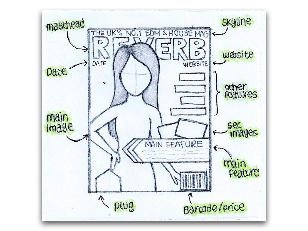
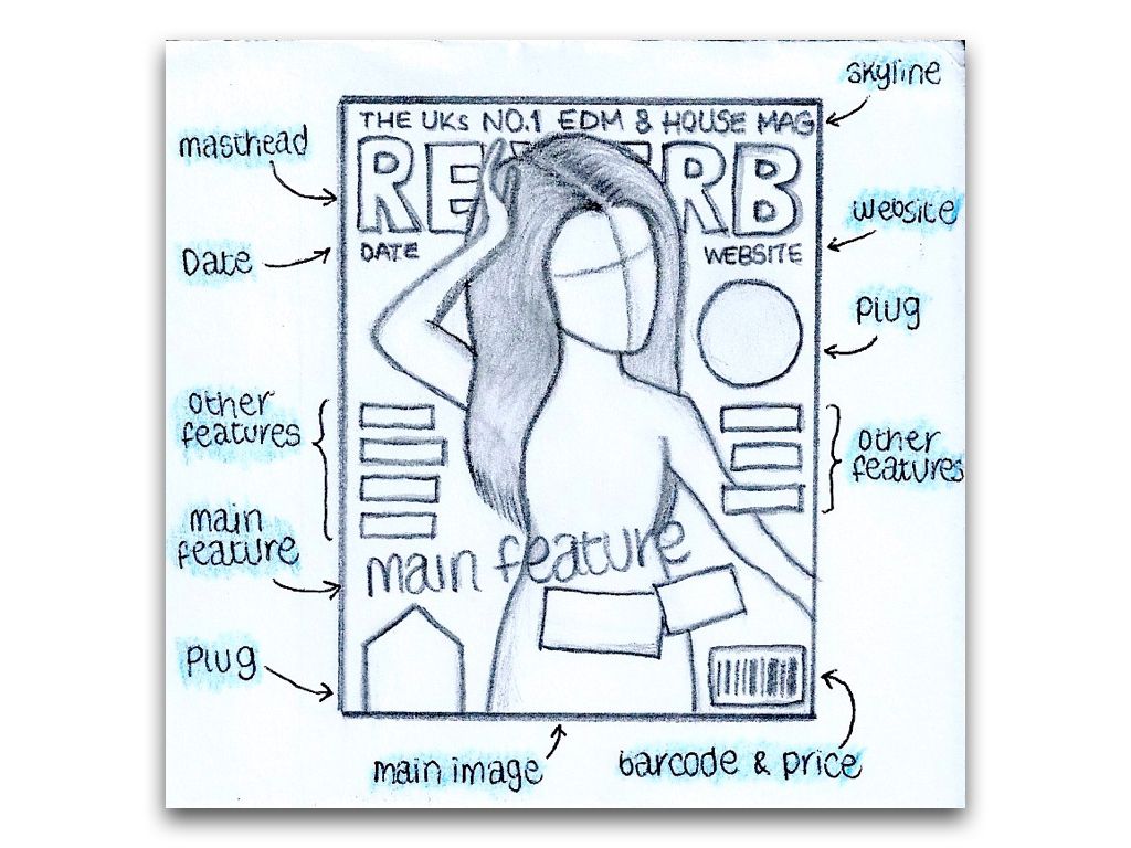
Below is a series of 3 sketches I did of layout ideas for my front cover, documenting ideas for poses, and feature arrangements to work around the images.


Test Shot Images

As with the previous project, we took test shots in order to gain a better understanding of the correct framing to use when taking portrait photographs for a magazine cover. Here, I have included 7 images of different framing types including examples of poor framing for a front cover. The medium close-up is most commonly used for magazine main images, and thus is the type of framing I will use for my main image.


Photography Analysis - Double Page Spread


Photography Analysis - Contents Page


Monday, 8 December 2014

Photography Analysis - Front Covers

In order to further gain information which would aid in the photographing for my final front cover, I found 3 front covers of music magazines from any genre and looked into the framing, costume, lighting, poses and props (if used) and how they were effective in attracting the target audience.


Overall, I liked this image due to the unusual outfit which Kraviz is wearing. Her pose along with the fact she is looking directly at the camera drew more attention to the cover, along with the framing of the image meant she was taking up just the right amount of space to allow the placement of other features; whilst still ensuring she was the largest feature on the page and thus drew more attention.


I chose this image as it was from a magazine which aims towards a slightly different genre of music, therefore it allowed me to compare and contrast the difference between the magazines. Unlike the other two magazines which I have analysed here, props have been included to further draw attention to the magazine, therefore making the image different from, and more eye-catching than the other two.


Lastly, I chose this image in particular for its inclusion of a background. Unlike the other two magazine covers which I have analysed, this image has a background which is heavily blurred due to the very shallow depth of field. As mentioned, this was the effect I attempted to achieve in my preliminary task. It adds extra colour to the image and thus draws more attention.

Friday, 28 November 2014

Focus Group

For this task, I found two students who matched the general profile of the magazine's target audiences and asked them questions relating to the magazine in a 'focus group' video.

After recording the video, I uploaded and edited it in iMovie from scratch. Below, I have attached a screenshot to show how I put together the video in order to achieve the desired effect.


I started by importing the clips and then adding them along with the text into the timeline. I did this as chronologically as I could to make it easier. I had to cut, chop and split clips as well as adjust the audio in some as you could hear me asking the questions in the background. After I got everything in place, I added transitions and tweaked the brightness to complete the visuals.
Lastly, I added audio. This was probably the most difficult part as I had to adjust the volume levels in places so the voices could be heard over it. Not only this, but the audio clip I used (a standard iMovie clip so as not to potentially breach copyright by using a downloaded one) was too short for the video; therefore I had to piece it together with an earlier chunk of the audio as best as possible in order to complete it.
The video took around 2-3 hours to complete.

Overall, I would have preferred it if I could have had more people answering questions in the video. However, this was almost impossible due to time limits and difficulties I was having with my camera on the day of recording. It took around an hour to record the video of Molly as my camera/SD card suffered writing issues and would cut off at various places in the recordings. To improve, I would have allowed more time to record, checked any potential issues with equipment before starting and asked more people to participate.

Response to Focus Group

Why was it useful?

The focus group were useful as they answered my questions in depth, often expanding upon their answers and explaining why. They gave me answers to questions which would help in the development of my magazine and articles which will appeal to the target audience such as 'What are your favourite artists?'. They answered questions that may help increase circulation of the magazine such as price and how often the magazine should be released.

How has it helped you in the decisions you will make when creating your magazine?

The focus group helped me in the decisions I will make for the magazine as they have given me ideas for feature stories and contents pages, advised how often the magazine should be released and in what format. Their answers have been helpful as it gave an insight into the views of my target audience and therefore suggested how it could be targeted better to suit them.

Did you find out something that you did not expect to?

I was fairly surprised at their answers for 'Would you prefer a paper or electronic copy?’ as a number of existing electronic music magazines publish them online. This is due to the fact that EDM music, being widely distributed electronically, is reflected well in the fact that the majority of dedicated magazines also release issues electronically. However, physical paper copies can sometimes be easier to read, look better and, as Victoria stated, are more authentic.

What were your general findings?

One of my general findings were that the target audience felt as though their genre was somewhat neglected in terms of magazines, “The genre that I listen to, they don’t really have a specific music magazine.” This further backs up the fact that I found the magazine research difficult due to a lack of existing products. I also found that generally, as a fairly young audience, they would prefer a cheaper price (£2 or £3-4 for a good quality magazine) and would only want to purchase it monthly in order to allow the best quality production and to avoid spending often.

Has it made you change any of your initial ideas?

The focus group hasn’t made me change any of my initial ideas as generally, their responses were relatively predictable. However, it has helped me to refine ideas and gain a better idea on the opinions of the target audience, thus backing up the decisions I had already made.

Wednesday, 19 November 2014

Audience Research - Social Class & Demographics

We began further research into our audience so that we could gain a good knowledge of the kind of people who would be reading our magazine and how to be target it so that it appeals to them. We looked into the different social classes within the UK, shown below in a table.


After conducting research into this, I decided upon the audience I would aim my magazine at and presented it in a Prezi presentation (below).

3 Looks for the Front Cover Artist

Mise-en-scène plays an extremely important part in magazine design, the artist in the main image needs to reflect the genre well in order to attract the target audience. I have created moodboards of general clothing worn by male and female EDM/house artists and then drawn up 3 looks each from the information I gathered in the moodboards.

Male Artists


Drawing up 3 outfits for male artists was fairly simple. There was a recurring theme of t-shirts, often tight-fitting v-necks, sometimes with prints but usually just plain black or white. Generally, black jackets or cardigans are worn over the top and trousers are nearly always jeans with trainer-type shoes. Main colours tended to be black, white and grey with the occasional bright colour such as a near-fluorescent green or blue.

For the first look, I chose a white v-neck t-shirt that was tight-fitting, along with a simple black jacket, jeans and nike trainers. For the second, I swapped out the white t-shirt for a black v-neck instead. I picked a pair of baggy grey jeans and black trainers, as well as a black snapback. Lastly for 'look 3', I found two t-shirts that were bright in colour and paired it with a black leather jacket, dark blue jeans and Converse trainers. 

Female Artists


Drawing up outfits for female artists proved to be extremely difficult as there doesn't seem to be a general theme with their costumes. Upon researching outfits which female fans of EDM music wear, there was definitely a recurring theme of tutu skirts, bras, leg-warmers and shorts all in neon fluorescent colours. However, this isn't necessarily reflected in the outfits seen worn by female fans in music and festival videos, and so is more likely a generalisation of club culture. For that reason, I instead focused my outfit research on female DJs and produced the above moodboard. Although there isn't a recurring theme with their outfits, they are all more suitable for a magazine cover and in my opinion, reflect the genre better.

Out of all the outfits in the moodboard, I personally liked those worn by Audrey Napoleon best (the artist with black hair and a block fringe, first image has a blue tint and the second image she is wearing a pink-purple skirt). These outfits in particular are very contemporary and modern-looking, which reflects the genre well as EDM and house are very new genres of music. I am hoping to achieve this similar contemporary look in the final images for my magazine.

Along with costumes for females, I looked for make-up ideas which were fairly versatile and could be manipulated to work with any outfit. The following video I found to be the best one as the eye make-up is fairly natural and the lip colour could be changed to suit any colour of costume

Colour Schemes

After I had decided upon the name of my magazine, 'Reverb' and looked at fonts, I settled for the same font which I used in my 'Reverb' Google mock-up for the masthead, 'Dylan Dog' as I believe it works well with the name and size and began to look at potential colour schemes for my magazine.


Wednesday, 12 November 2014

Names for my Magazine

In order to come up with names for my magazine, I researched the genre further and looked out for key words which I could use and/or manipulate to create a name. I came up with a few and presented them in a Prezi online presentation along with a description of why I like each.

After conducting research into different names I finally decided upon the name for my magazine which would be 'Reverb'
I then took different fonts which I'd collected from around the internet, mostly from 'DaFont' and wrote the name of my magazine in them and presented them on powerpoint documents, shown in images below.

Tuesday, 11 November 2014

Moodboard of General Costumes

I have created a moodboard of general costumes that includes images of different fonts, existing magazines, clothing and products which may attract the target audience. These all give me a better idea of the kind of content I should be including within my magazine and how to target it better so that it appeals to the relevant audience.


I included a wide variety of different fonts, including ones which could be used as titles, subheadings and body text. Most of the fonts I included are written in the names of them and so this may prove to be helpful later if I wanted to find and download that font for use. I particularly like the 'Voix' font for a masthead as it draws attention due to the filled-in 'o' and personally, it reminds me of the font used for Mixmag's masthead. Therefore, I immediately associated it with the genre. As shown (and described) with the Nylon magazine, I like how they have written the main feature story header in a handwritten-style font in order to draw attention and for this reason, I included a number of messy, handwritten-style fonts. Personally, I liked 'Rebel' and 'Raw Row' out of the ones shown.

By displaying existing magazines collectively allowed a general colour scheme to appear which could be associated with the genre, the main colours usually being dark and complimented with white text. The main image of artists are usually medium shots against a plain background, though some have been edited to have interesting overlays (similar to that which I used in my google mock-up). This will help later when it comes to designing layouts and colour schemes for the front cover as well as clothing for the main subject.

The images of the audience in the bottom left-hand corner allowed me to see a general pattern with the age and gender as well as the clothes which they are wearing. As clearly shown, they are generally quite young and a mix of both male and female (which backs up my reader profile research). They are mostly wearing bright, often fluorescent colours and minimal clothing. From these images and further research I drew up several images of clothes which may be associated with EDM and house music and displayed them around the bottom half of the moodboard. However, the clothes shown don't necessarily match those seen on the existing magazines as they are generally more casual and sometimes smart (though they are nearly always 'current' and 'fashionable'). EDM and house are very new genres of music, and so it could be argued that a particular 'style' of clothing has not yet clearly emerged from it. 

Lastly, I included images of products which may be of interest to the target audience. Generally comprised of technology including mobile phones, laptops, speakers, headphones and game consoles; it gives us a better idea of the kind of people reading the magazine. Not only products, but there are also images of well-known festival logos which readers of the magazine may be likely to spend money on. These include Tomorrowland, Creamfields, Defqon, Electric Zoo, Qlimax and EDC as well as event organising company Q-Dance. This information will be useful for future use as it gives us an idea for feature stories, plugs or article content which may attract our target audience.

Monday, 3 November 2014

Google Mock-Ups - Contents Pages

After completing the mock-ups of my front cover, I then designed Google mock-ups contents pages. I made them to match both the magazine covers which I made, so I included the same artist as the main image and included all the relevant contents in relation to the feature stories on the front.

Control

Original Image which I used within contents page

Contents Page Mock-Up
   I started by opening a blank image into PicMonkey and applying the 'fade' effect to give it a slightly beige-coloured vignette background. I then added the title, date and magazine name and the dashed line underneath it. Then, I saved the image and opened it up into Pixlr Editor and added the main image and placed a border around it before opening it back up into PicMonkey so that I could add the page numbers, feature stories and descriptions. I made sure to leave space next to the descriptions for additional pictures, and added these later in Pixlr Editor. Finally, I opened the image into Pixlr Express and added various filters and tints before saving it as a final edit. I did go back and change the filters a number of times, however. 

   The layout of the contents page with the main image being on the left and the text around it was loosely based on MixMag's contents page. I tried to make the colour scheme of the contents page match the front cover I designed for 'Control' however, I don't think I achieved this very well.

   The main image which I used for this is in fairly neutral colours, mostly browns and beiges, and so I based the rest of the colour scheme around it with the hopes of fixing it to look brighter and more colourful later in Pixlr Express though this wasn't wholly achieved so the colour scheme is still very neutral. I think the colour scheme works well with the three images that I used, however I don't think it fits the the music genre which my magazine will be based on as well as the style which I used for the 'Reverb' magazine.

   I made sure to include all the relevant conventions of a contents page including the title, magazine name, date, page numbers, feature stories, descriptions, main image and secondary images. However, I think the page itself looks a little bare and is missing additional information. On the other hand, it could be argued that the simple layout and appearance makes it clearer and easier to read and therefore easier to find what you are looking for quicker. The main image is of Martin Garrix which matches the main image/feature story on the front cover and further emphasises the importance of that article. It also grabs the attention of readers and non-readers who may be fans of his music and so would be interested in reading an article exclusively about him.

   Overall, I wasn't entirely pleased with the outcome of this contents page. I think it looks a little bare and doesn't match the 'Control' front cover design very well. To improve the layout and appearance of the magazine I could include more information such as the names of contributors to the magazine, a short description about an upcoming album release, social media news, and so on. I would also use a different style of font as I don't think it matches the colour scheme or style of the contents page very well. It looks too 'contemporary' and would be better suited to a style like the 'Reverb' front cover and contents page which has a more modern feel to it. Lastly, I would use a different colour scheme as I don't think the colour scheme which I chose for this contents page reflects the music genre as well as the one used in the 'Reverb' magazine mock-up. The colours are a little too 'soft' and 'warm' and are therefore not as eye-grabbing as the mock-ups which have used brighter colours.


Reverb

Original Image which I used within the Contents Page
Contents Page Mock-Up
   I started by opening a blank image on Pixlr Editor and filling the background in black. I then added the title, layering up multiple bright colours and adjusting the opacity to give the desired effect. I then recreated a similar effect on the image of Miss Melera by drawing a selection around her and copying and pasting the image multiple times, adjusting the colour and opacity of each. I added the date and a random page number over the top of the main image. I then opened it up in PicMonkey and added the feature stories, descriptions and page numbers. I realised at this stage I'd made a mistake with the page number that I'd pasted over the top of the main image and so covered it up with coloured boxes in the same style as the title and main image and re-wrote the page number on top. Lastly, I opened the image back up into Pixlr Editor and inserted the secondary images before opening it in Pixlr Express and adding the same diamond overlay pattern that is seen on the front cover.

   The contents page was heavily based on the google mock-up front cover, 'Reverb' which I had designed previously as I wanted it to match as though it were part of the same magazine. I based the colour scheme of it not only on the front cover but on the contents pages seen in MixMag as they always feature black backgrounds with white writing over the top.

   The main image which I used for this was in black and white so, again, I had to make a colour scheme for it. I based it upon the colours in the front cover which are generally bright colours such as pinks, purples, blues and greens. The colour scheme is a good reflection of the music genre which I am aiming my magazine at as the bright colours and dark background reflect, as previously mentioned, a clubbing or festival environment. The triangle overlay effect adds shapes and draws the attention of the reader.

   Again, I made sure to include all the relevant conventions of a contents page such as page numbers, feature stories, descriptions, a title, date and main image. I laid them out clearly in order for readers to find what they are looking for quickly and easily and this included putting the page numbers in a different colour in order to clearly differentiate them from the article names. The main image is of Miss Melera and I included this image as it relates to one of the main feature articles and the front cover of the magazine since she was the main image on the front cover mock-up.

   In order to improve this, I would condense the article lists down and include other information such as an editor's message/welcome or a list of the names of people who contributed to the making of the magazine. I could include links to the magazine's social accounts such as Facebook and Twitter in order to engage with the reader and keep them up-to-date via social networking (therefore making them more likely to continue purchasing the magazine) or latest news on the website.

Google Mock-Ups - Front Covers

In order to demonstrate that I have learnt and understood from my conventions analysis, I have designed a front cover as a 'Google Mock-Up' using images from Google. I took an image of Martin Garrix, a well-known DJ in EDM and house music and edited the image on various online image editing websites including PicMonkey, iPiccy and Pixlr.

Control

Original Image
Mock-Up Image
   I started with opening the original image into PicMonkey and cropped and adjusted the image exposure to make the colours appear brighter and then added a lens-flare-type filter called 'spotlight'. I then opened the image into iPiccy to further edit the colour and exposure of the image before saving it and opening it into Pixlr Editor - a very basic photoshop-like online programme - and used it to add the masthead, date, issue and skyline. Then, I opened the image back up into PicMonkey and added the main feature and other feature story, footer and plug. Lastly, I used a different Pixlr app called Pixlr Express to further add colour to the image through the use of 'light leak' filters before finally opening the image back up into Pixlr Editor to add the barcode and secondary images through layers.

   There are aspects of the cover which I pulled from design ideas in my conventions analysis and genre research. This includes the 'Magazine' being within the title text (seen on Tilllate's magazine cover in my genre research), the date and issue being in a vertical, column-like layout (inspired by Billboard's cover in my conventions analysis) and the footer being on an angle (Tilllate's front cover in my conventions analysis). 

   Since the original image didn't have enough colours to follow the three-colour conventional rule I emphasised the orange jumper which the main subject is wearing and used colours which I believed complimented it so that I ended up with a colour scheme of three main colours - orange, green and purple. The orange and green colours reminded me of the Autumn season which works well with the date of release of the magazine (October) and the purple provided a 'pop' of colour to draw attention to the magazine and reflect the often bright, fluorescent colours seen within the EDM and house scene. By overlaying 'light leaks' gives the magazine an all-round dreamy look.

   I ensured that I used all the relevant conventions of a magazine (i.e. masthead, plug, footer, etc.) as I found through conducting research and analysis into it that it aids in drawing more attention to the magazine whilst providing as much information as possible. The plug is relevant to the music genre as it offers the chance to win tickets to upcoming Q-Dance festivals, a renowned event-organising company in electronic music who host large festivals such as Defqon and Q-BASE. The main image is of Martin Garrix, a famous young DJ in EDM and very well-known, and I related this to the main feature article. Not only did I make this the largest feature story on the cover but I added secondary images to further attract attention. 

   To improve this, I would maybe use a different subheading text for the main feature article as I don't think it looks suitable for subheading text. I would also include more feature articles as there are currently only two minus the footer and, personally, I don't think it provides enough information about the features within the article. Lastly, I would probably change the title text as I don't think it looks particularly eye-grabbing due to it being a fairly dull colour compared to the rest of the cover.


Reverb

Original Image
Mock-Up Image
   I started by taking an image of Miss Melera (a female EDM and house DJ whom I discovered through conducting conventions analysis research on Tilllate Magazine), and opened the image into iPiccy to adjust the crop and exposure. I then opened it into Pixlr Editor to add the masthead, date, website and skyline. The original skyline which I put in had a gradient rectangle similar to the previous mock-up, however I changed this later. In order to achieve the desired masthead effect, I inserted the same title three times and then adjusted the opacity, making sure to erase each so that it didn't overlay the subject and appeared to be in the background. Then, I opened the image up into PicMonkey and started adding the plugs and feature stories. This is where I changed the header by overlaying it with a simple black rectangle and re-writing the skyline in the same font. Lastly, I opened the image into Pixlr Editor once again and added the secondary images before finally opening it into Pixlr Express and adding the triangular-shaped overlay.

   This magazine cover was influenced by a number of ideas such as the Mixmag front cover in my genre research of Sub Focus, which features the triangle overlays and angles on the shapes placed behind the text. I also took influence from Miss Melera's own website, which heavily features disorienting overlay effects and bright colours.

Screenshot from Miss Melera's official website

   Just like in the previous mock-up, the original image had very little colour to work with and so I had to invent a colour scheme which would work with it. The main colours within this are bright pinks, purples, lime greens and a little bit of blue with predominantly white text. This works well with the chosen music genre as it reflects a clubbing environment where there would be a dark room lit with bright colourful lights with an all-round disorientating effect.

   Again, just like with the previous mock-up I ensured that I had used all relevant conventions including a masthead, skyline, footer, date, website, main feature story, other feature stories, secondary images and plugs. I ensured that these were all clear and most of them in bright, eye-catching colours in order to attract the attention of the audience. However, I did forget to add in a barcode and/or price and will ensure I do this next time in order to make it appear more realistic. The plugs are relevant to the music genre as they offer a festival guide and advertise a new album which will attract the target audience who generally have a lot of disposable income to spend on festivals and CDs. Just like with the previous mock-up, I related the main image to the main feature article and added secondary images in order to further attract the attention of the audience.

   To improve this, I would make the current feature stories smaller and add in more so that extra information could be included and utilise the space better. I would also need to include a barcode and/or price so that it looked more like a realistic magazine cover. To do this, I would maybe move the website so that it is within the actual masthead text just like the previous mock-up and place the price where the current placement of the website name is.