photo df6c61c2-1dcf-4d34-97a6-59633658c879_zps566fb51b.png  photo 88742518-9212-40a9-97df-b96b9b5f9b58_zpsbbc41c1a.png  photo 6f2f240d-94fe-4078-b789-6126579f882b_zps09d8f470.png  photo 84f02e05-b1dd-4b9f-9b69-001d77a9d3b7_zpsc0fad091.png  photo a012b001-f640-45fb-a932-ef021a8f6ab4_zps7383bc04.png

Friday, 2 January 2015

Process of Making - Front Cover


I started by opening this image in Photoshop and adjusting the levels, brightness and colour balance in order to even out the image. I also added a gaussian blur to give Victoria's skin an airbrushed effect and used the blemish tool to remove minor details. It wasn't really needed, however it was applied it in order to give the image the same 'flawless' effect which you might see on a magazine cover.

As shown in the below screenshot of the layers, there are two layer patterns on top of the adjustments. I attempted to recreate the geometric patterns that were temporarily available on Pixlr and which I used in my Google mock-ups by layering the patterns over the main image and changing the blend mode. These didn't work as well as I hoped however, 'Layer 2' was used as it gave the main image a faint pinkish tint and added a slight 'watercolour' effect to the masthead.


Next, I added the title. Sticking to the same title theme that I applied to my Google mock-ups, I added three title layers beneath the 'main' opaque masthead and made each layer have a lower opacity than the layer above, creating the effect shown below.

At this stage, I also began grouping the layers as shown in the screenshot below. There is a group for 'Main Image Edits' which contains all the layers in the screenshot above. This made the editing process quicker and easier on a whole.


After applying the title effect, I adjusted the colour in order to find one which went with the image the best. I couldn't decide which colour suited the cover best and so asked other students who were in the room and sent out messages on my phone asking friends who weren't there. There was an overwhelming response for purple, however, there was an awful lot of votes for the blue and pink mastheads as well. Eventually, we settled on purple as somebody pointed out, it was the colour which matched Victoria's lipstick best, and so I decided to emphasise that feature and painted the lipstick with a purple tint that matched the masthead to make it stand out more.


In order to have Victoria's head overlay the title, I made a polygon selection around her head and made a new layer from the selection cut. This went over the group 'Title Overlays' which contained all the layers for the masthead so that the head would overlay it, as well as under the 'Main Image Edits' so that it kept all the same adjustments as the background layer.

As shown in the second and third images below, at this stage I added the plug and main feature story title. After conducting research into fonts and other existing magazines earlier, I finally decided to use a handwritten font for the main feature story to draw maximum attention. For Victoria's name, the blue colour similar to the discarded masthead colour earlier suited it and white for her middle names contrasted it well (however isn't all that easy to see).


As for the plug, I wanted the words to arc so that it worked better with the spherical shape and used the 'Warp Text' tool to do this. I played about with different fonts and colours until it looked right, as well as changing the opacity of the plug at the end to make it more visible. 

Also shown in the series of screenshots below is how I made the feature stories. They originally started out as being simple rectangular shapes, however I cut an angled shape out of the side to draw more attention and make them look more visually appealing on a whole. 

Front Cover - Final Images

This video shows the set-up for the photoshoot


Contact sheet showing all the images taken


Below are the 12 best images I thought would work best as main images for a front cover

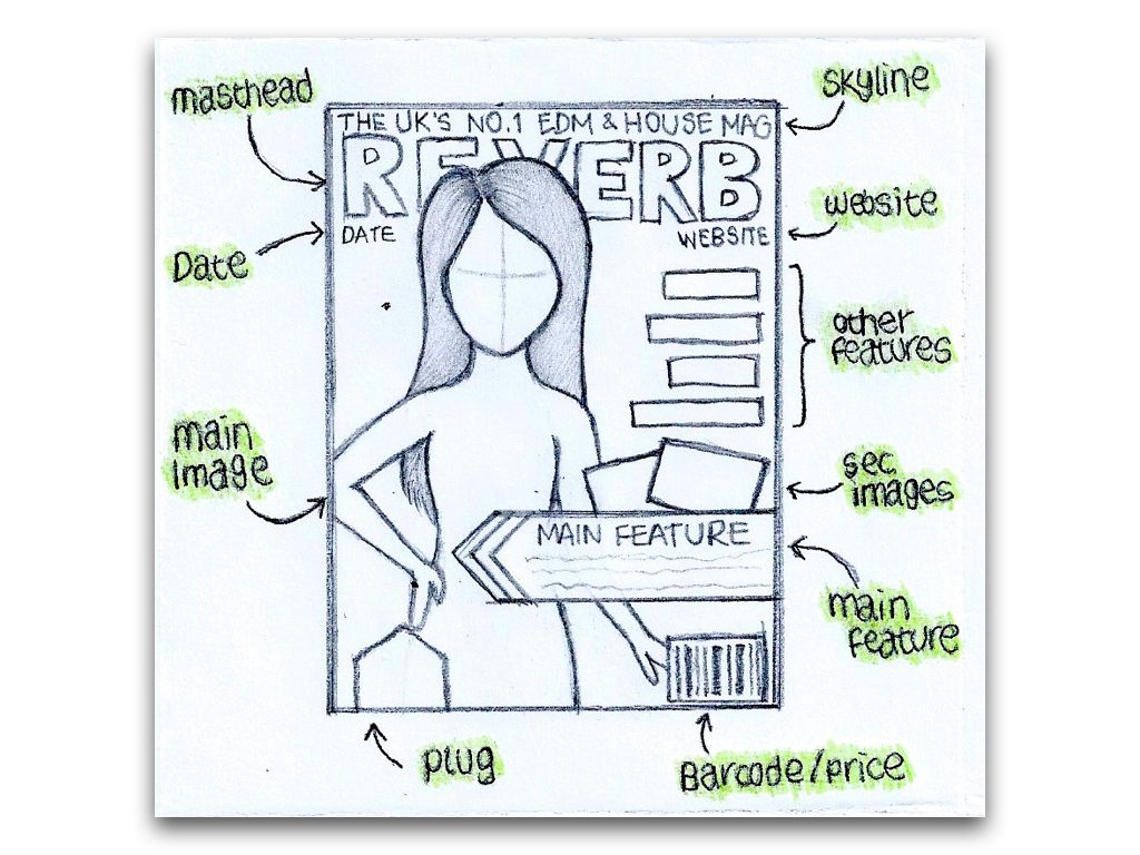
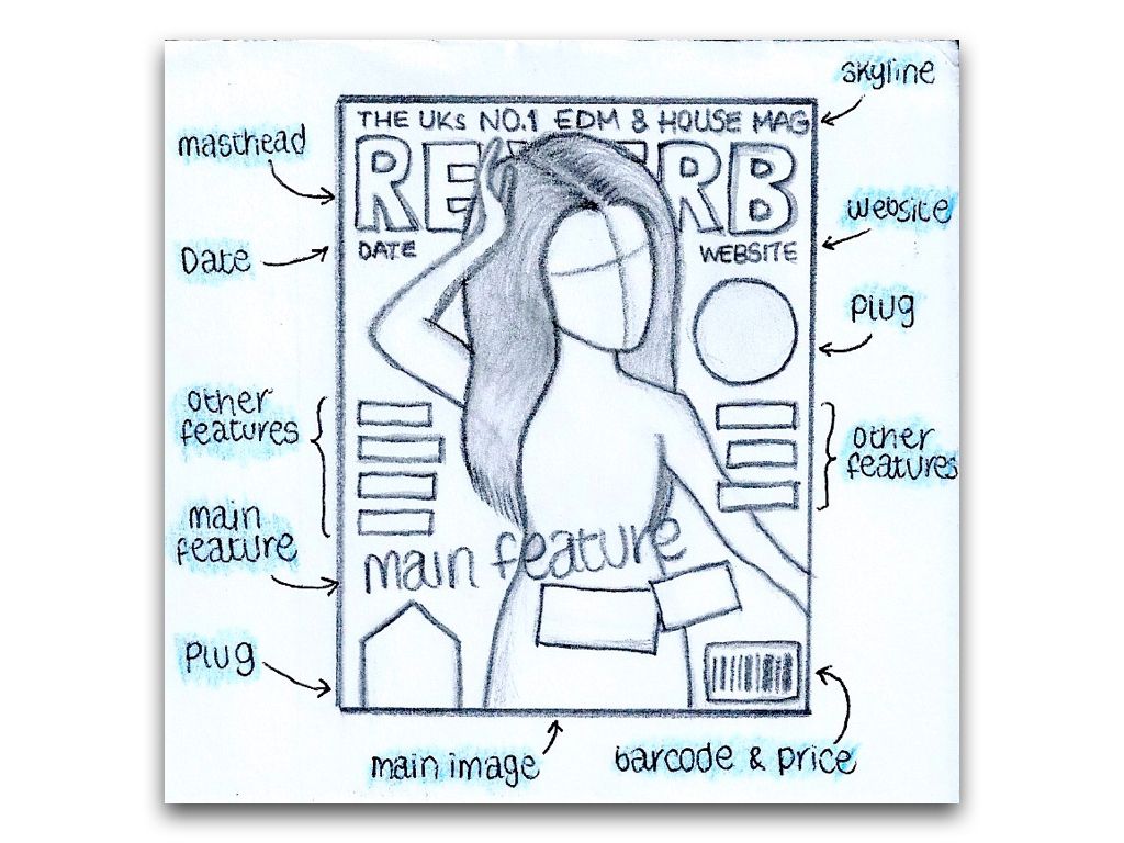
Sketches of Front Cover Layout Ideas

Below is a series of 3 sketches I did of layout ideas for my front cover, documenting ideas for poses, and feature arrangements to work around the images.


Test Shot Images

As with the previous project, we took test shots in order to gain a better understanding of the correct framing to use when taking portrait photographs for a magazine cover. Here, I have included 7 images of different framing types including examples of poor framing for a front cover. The medium close-up is most commonly used for magazine main images, and thus is the type of framing I will use for my main image.


Photography Analysis - Double Page Spread


Photography Analysis - Contents Page


Monday, 8 December 2014

Photography Analysis - Front Covers

In order to further gain information which would aid in the photographing for my final front cover, I found 3 front covers of music magazines from any genre and looked into the framing, costume, lighting, poses and props (if used) and how they were effective in attracting the target audience.


Overall, I liked this image due to the unusual outfit which Kraviz is wearing. Her pose along with the fact she is looking directly at the camera drew more attention to the cover, along with the framing of the image meant she was taking up just the right amount of space to allow the placement of other features; whilst still ensuring she was the largest feature on the page and thus drew more attention.


I chose this image as it was from a magazine which aims towards a slightly different genre of music, therefore it allowed me to compare and contrast the difference between the magazines. Unlike the other two magazines which I have analysed here, props have been included to further draw attention to the magazine, therefore making the image different from, and more eye-catching than the other two.


Lastly, I chose this image in particular for its inclusion of a background. Unlike the other two magazine covers which I have analysed, this image has a background which is heavily blurred due to the very shallow depth of field. As mentioned, this was the effect I attempted to achieve in my preliminary task. It adds extra colour to the image and thus draws more attention.